First off, what’s a histogram?
A histogram is just a chart that shows counts of items in discrete buckets. In other words, a bar chart.
The histogram tool in Excel lets you define the groupings or buckets. Or, in the terms of the histogram you get to define the Bins. A standard bar chart in Excel will just chart the individual distinct values, which is often not what you need to do. Using the histogram tool you can have Excel automatically count the items in the various Bins you define, and then chart those.
Note: You may have also heard of a Pareto chart. That’s just a histogram sorted from highest count to lowest.Here’s an illustration to highlight the difference
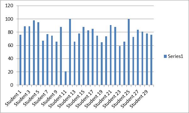
Imagine you’re a teacher and you need to plot the grades for your class. A normal bar chart would look like the following.
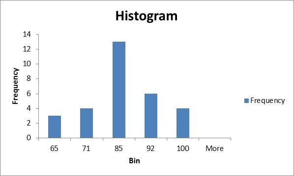
However, a histogram using defined Bins could look like this (each bar representing a grade range).
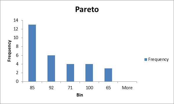
And just for illustration, here’s the same data presented as a Pareto chart (histogram sorted in descending order).
Using the histogram tool in Excel
First, you need to have the Analysis ToolPak enabled. If you’re not sure how to turn that on, check out my earlier blog post on how to enable the Analysis ToolPak in Excel for the quick steps.
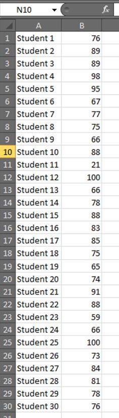
Let’s set up data as in the image to the right. It doesn’t really matter what you name the students or which scores you give them.
Next lets add the grade list that we’ll use to define the Bins or groups for our histogram. The image below is what I used for this example. Feel free to tighten up or loosen up the ranges as you see fit. It’s your class, right?
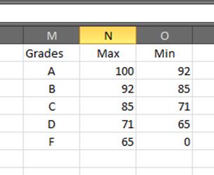
Let’s take a moment and look at the groups or Bins defined above because this part may be a bit confusing. The way that the histogram tool counts items up is that it groups or counts items that are greater than the next lowest boundary. So in the grading example above, the histogram tool will count any items above 92 (not including 92) and up to and including 100, and then count items above 85 (not including 85) and up to and including 92, and so on.
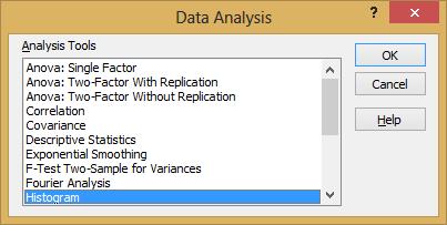
Now, on the Data tab click Data Analysis in the Analysis group (or Data Analysis from the Tools menu in Excel 2003).
Click Histogram from the Analysis Tools list. Then click OK.
Click in the Input Range field, and then highlight the scores (not the names) of the students.
Click in the Bin Range field, and then highlight the Max scores from the grading criteria you entered a couple steps above.
Finally, be sure to click the Chart Output checkbox if you want to see the histogram chart. Otherwise you’ll just get the data table.
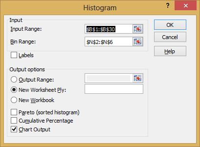
After you’ve set the ranges and checked the boxes you want, click OK.
Tada! Your histogram along with it’s data table are added to your workbook.
There you go.