“Resource utilization charts”
The name I use to refer to these charts is “resource utilization chart”. I use this name because that’s what I’ve come to know them as within Microsoft Project. They may have another, better suited name. If so feel free to note that in the comments below.
Edit: Resource utilization histogram
Going for a PMP certification? You’ll need A Guide to the Project Management Body of Knowledge: PMBOK(R) Guide![]() .
.
Strategy for creating the resource utilization chart
The general strategy here is to use a stacked column chart, and define a pair of calculated fields from the data that will actually be charted. I explain that more below, and use a scenario that may be similar to one of yours to help make it clear.
So, let’s jump in with a scenario
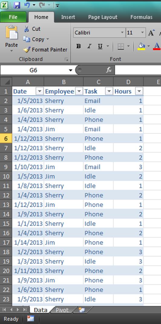
We’ll start by creating some sample data. In this case, imagine you have a simple time tracking sheet where each entry tracks the date, employee name, task, and number of hours. And you want to create a chart that shows when an employee works more than 6.4 hours in a day (80% utilization in an 8 hour day). Here’s what that might look like.
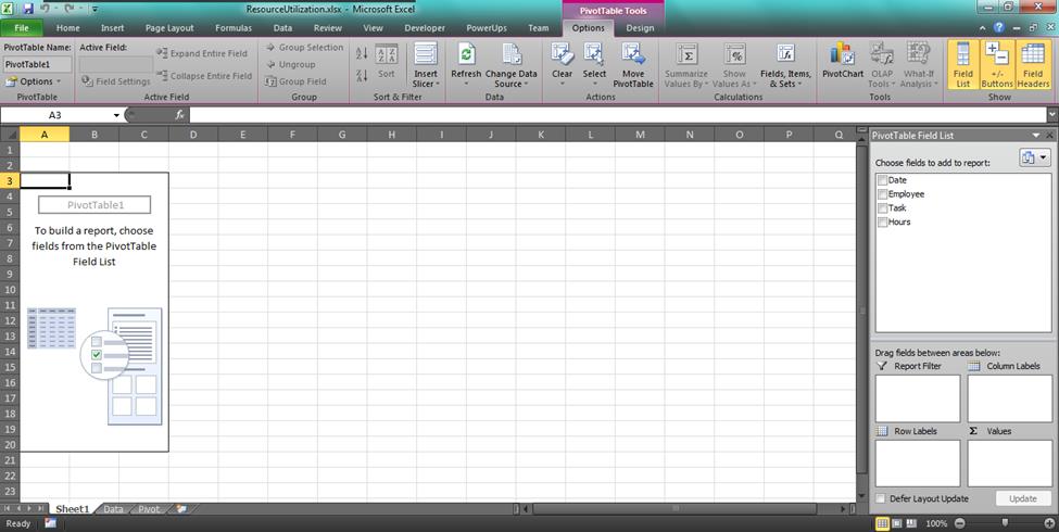
From this data, create a pivot table. Do this by clicking anywhere in the table, then click the Insert tab. Then click PivotTable. You’ll wind up with an empty PivotTable as pictured below.
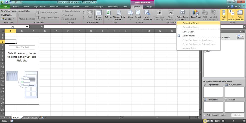
Click anywhere in the PivotTable. Then click the Field, Items, & Sets button. You’ll find this on the Options tab in both Excel 2010 and 2013. Then, click Calculated Field.
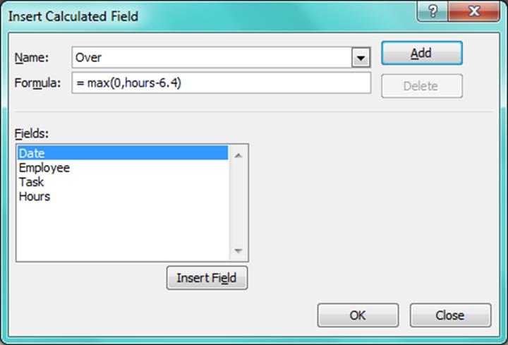
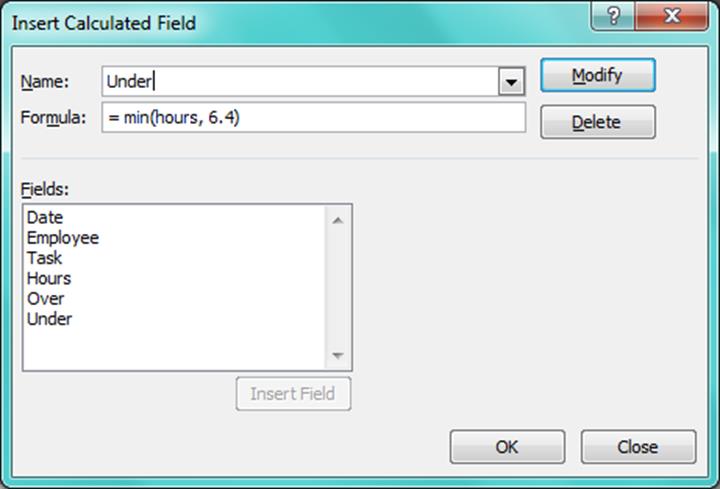
This is where you need to set up two new fields. We’ll call them “Over” and “Under”. Under will represent the time spent under the utilization target (6.4 hours) we set at the beginning. Over will represent the amount of time spent over that target.
We’ll use the following formula for the Over calculated field.
=MAX (0, Hours – 6.4)
This will give us the greater value of the number of hours over the target, or 0. If the number of hours is below 6.4 we would have a negative number from Hours – 6.4.
We’ll use the following formula for the Under calculated field.
=MIN (Hours, 6.4)
This will give us the lesser of the total number of hours, or 6.4.
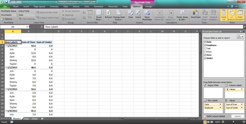
With these two calculated fields, we can add them to the PivotTable. Using the Date and Employee dimensions as the row values we get the following PivotTable.
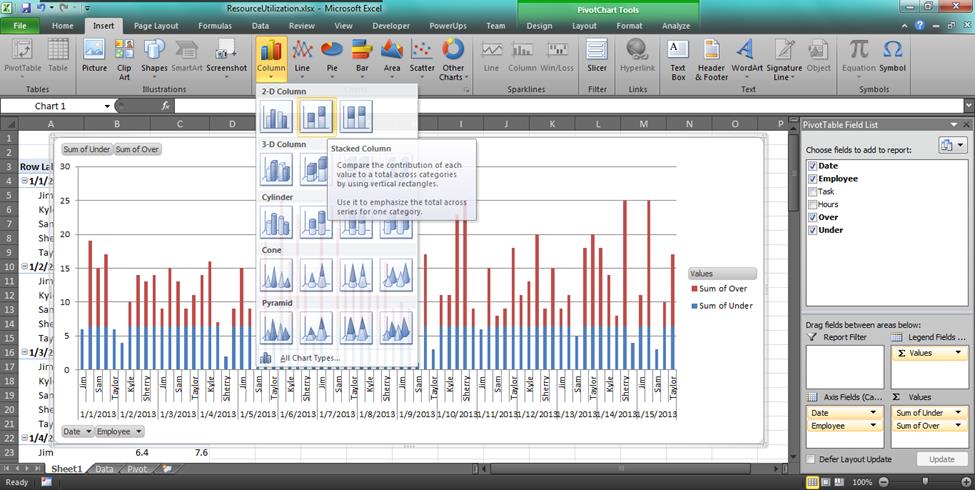
Now, add the stacked bar chart. Click the Insert tab, then select the stacked column chart.
Voila!
Here’s your completed Resource Utilization Chart.
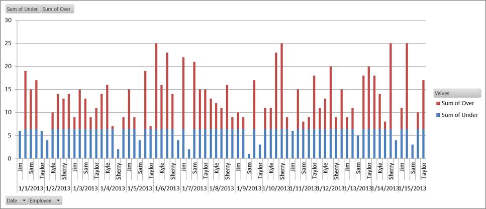
All values above the threshold are in one color, all at or below the threshold are in another color.
Sample Sheet
A couple people have asked for a sample sheet to look at. I created a small one and linked to the sheet for download below.
There you go.


do you have a sample sheet I can use, rather than create it from scratch? 🙂
I looked real quick and I don’t think I saved the sheet I created the sample from. But it would only take a few minutes to mock one up from scratch. Ping me back if you get to a stuck point and I can upload a sheet later.
Update: A small example workbook has been added at the bottom of the post.
I was able to work off of your instructions. So far so good. Thx
This is fucking orgasmickally awesome!!!
How shall i calculate for a week.
Hi, i wanted to calculate for 12 members in a team for over a week. Can you please tell me?
I’d say in general, organize your data so you have a total number of hours for each of the team members first. Then, apply the approach outlined in this article to highlight where any individual total exceeds your threshold value for the week.
HTH
This is great, but how do you get the pivot table and chart to update when you change the hours value on the in the “data” sheet tab? Do I have to recreate the pivot table? Your example shows a “data”,”pivot”, and “chart” tab. Thank you
If the data changes or is updated in the source data, you can refresh the pivot table by right-clicking the pivot table and selecting Refresh from the context menu.
Can anyone send me their sample of the worksheet. I am having trouble following. Thank you in advance for your help!
Hi, I added a sample sheet and linked to it above at the bottom of this post.
Charlie,
I am trying to create a machine utilization chart for a manufacturing company with 3 shifts. There are 27 machines,. I need to create an excel spreadsheet data base that I can enter time, date, and hours running per shift, and then be able to take all of this information either daily, monthly, or yearly usage and place it in a bar chart. Although I have tried using the information above, the calculations are different and I am unable to make it work correctly. Can you help?
thank you,
Jacquelyn
Hi Jacquelyn, if you sent a copy of your worksheet with sample data and the formulas you have I can take a look.
Send the sheet to support@officepowerups.com and explain the intended purpose of the sheet.
Thanks,
Charlie