What’s an Excel Burndown Chart For?
In agile or iterative development methodologies such as Scrum an Excel burndown chart is an excellent way to illustrate the progress (or lack of) towards completing all of the tasks or backlog items that are in scope for the current iteration or sprint.
Excel can be an effective tool to track these iterations, or sprints, as well as report on the progress using a burndown chart in Excel.
We’ll break the task of creating an Excel burndown chart into four main groups.
- Set up the sprint’s information.
- Set up the work backlog.
- Set up the burn down table.
- Create the chart.
Setting up the Sprint Information for Your Excel Burndown Chart
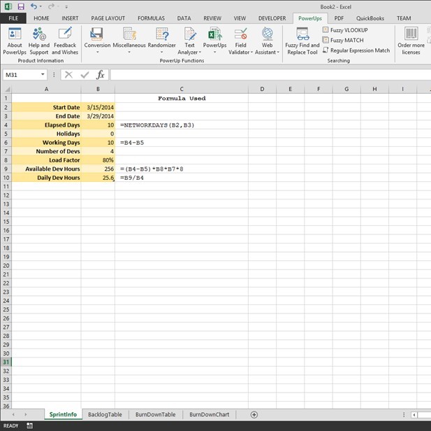
The key thing the Burn Down chart will show is a plot of the amount of planned work against the amount of remaining work. To figure out the amount of work that can be done in a sprint, in its simplest form, is calculate the total number of developer or person-hours collectively available.
In this tutorial, I set up as below. You can elect to simplify of course.
First, you can get the number of calendar working days between a start and end date. The NETWORKDAYS function in Excel is handy for this. Additionally, you can allow for holidays or other special days and subtract from the calendar working days. This will give you the number of working days for this sprint. In this example, I named the working days cell WorkingDays to make some formulas later easier to read/follow.
Next, the number of developers is provided along with the load factor. In this example I used 80% as an indication of the level of productivity or utilization for development tasks. Remember, things like meetings, training, bio-breaks, vacation, illness, etc all come out of the 100%. Coming up with a factor this best represents your team will help in the overall estimation and capacity determination.
With the information described above you can calculate the total number of developer hours. You can use days too, depending on the level of granularity you need. Eight working hours/day is assumed in this example.
WorkingDays * LoadFactor * NumberOfDevs * 8
The number of developer hours available on a given day is as follows.
TotalDeveloperHours / ElapsedDays
You can see this set up in the sample workbook image below. The formulas used are placed next to the cells.
Setting up the Sprint Backlog Table for an Excel Burndown Chart
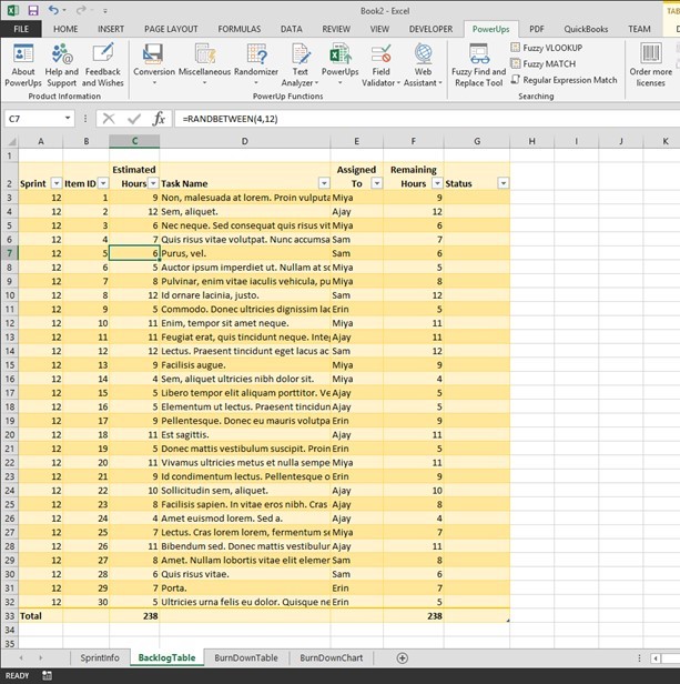
A sprint, or iteration, is bound by a set amount of time (usually in weeks) and a set of work items to be completed. Items queued up on the work list are called the sprint backlog.
The sprint backlog table needs to have three key columns. They are the work item ID, the amount of time estimated to complete the item, and the amount of time remaining to complete the item. Initially, the amount of time remaining is equal to the initially estimated amount of time.
You can add additional columns to suit your needs. For example, you may want to add columns to identify the sprint number, the name of the task, the person the task is assigned to, and the status of the item. I’ve added these columns for this example too.
At the bottom of the table you will have two number of interest. The first will be the total amount of time estimated for this iteration or sprint. I named this cell TotalHours in Excel. The second will be total number of remaining hours. As mentioned above, these two numbers are the same at the start of the sprint.
The image below shows the sample sprint backlog table I used in this tutorial.
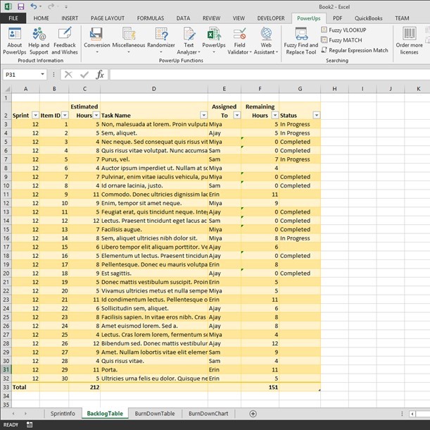
As you work on the items in your sprint, you will update the values for the remaining amount of time (Remaining Hours in this example). When an item is completed, set it’s remaining amount of time to zero. I also chose to indicate a status of “In Progress” in addition to “Completed”. The image below illustrates this.
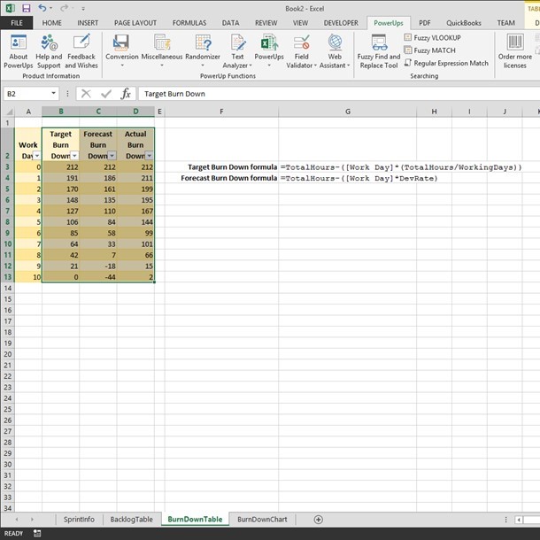
Setting up the Burndown Table for Your Excel Burndown Chart
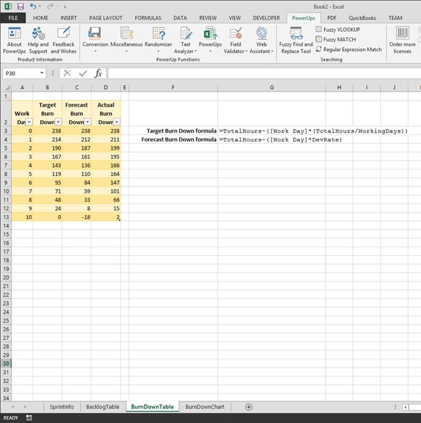
So far, you have set up to determine the amount of work needed as well as how much work is left to perform. Since an Excel burndown chart needs to show how your team is tracking to completion over time, you’ll set up another table to figure out the ideal rate of completion to compare to the actual rate of completion.
In this table, the first column will list the days in the sprint. Create one row per day.
Next, create a column to represent the ideal progress towards completion. I called the column Target Burn Down. In this column, the formula used is the following.
=TotalHours - ([Work Day]*(TotalHours/WorkingDays))Add another column for the actual progress. I called the column Actual Burn Down. In this column, you will enter the number of actual remaining hours from the sprint backlog table each day. You would do this after polling your team on their progress to date and updating the sprint backlog table data.
In this tutorial example, I also added another column called Forecast Burn Down. I set this up to represent the projected progress based on the number of available developer hours. This would give an idea as to whether the amount of work in the sprint was too much or not enough. The formula is as follows.
=TotalHours - ([Work Day] * DevRate)This table is pictured below.
Creating the Excel Burndown Chart
At this point you’ve the setup work. The actual Excel burndown chart is simply a line chart. Select the columns that track the burndown. In this example we’ll use the Target, Forecast, and Actual Burn Down columns.
Select a line chart type from the Insert tab on the ribbon. I used the 2D line with markers chart type.
In the chart, select the numbers across the x-axis and change the label range to the numbers in the Work Day column. In this example, I just used the numbers from 0 thru 10 for each day. You could the rows Day 1, Day 2, etc.
I changed a couple colors and the Excel burndown chart produced is below.
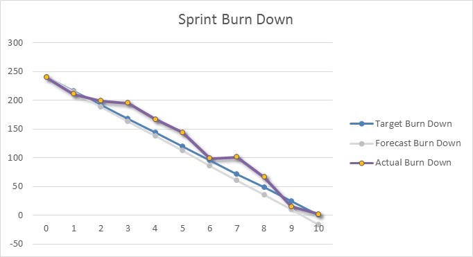
Reading the Excel Burndown Chart
In the Excel burndown chart picture above, any point above the blue line (Target Burn Down) indicates work is not tracking to on-time completion. Conversely, any point below the blue line indicates work is tracking to early completion.
The light gray line in this example shows the amount of work included in the sprint is slightly less than the estimated team capacity.
An Excel burndown chart can be an effective way to illustrate the progress a team is making towards completing all of their items on time and can give the team some easy to see information needed to better manage the sprint to help ensure successful completion.
Get a Jump Start with an Excel Burndown Chart Template
You can get an Excel template for a burndown chart here.
There you go.


you didnt mention anything about actual burndown column
Hi, the ‘actual’ column is not based on a formula. It’s the result of asking your team what their actual amount of remaining work is. You’d update that value each day. During the sprint, the Actual Burn Down line would only run up to the current day.